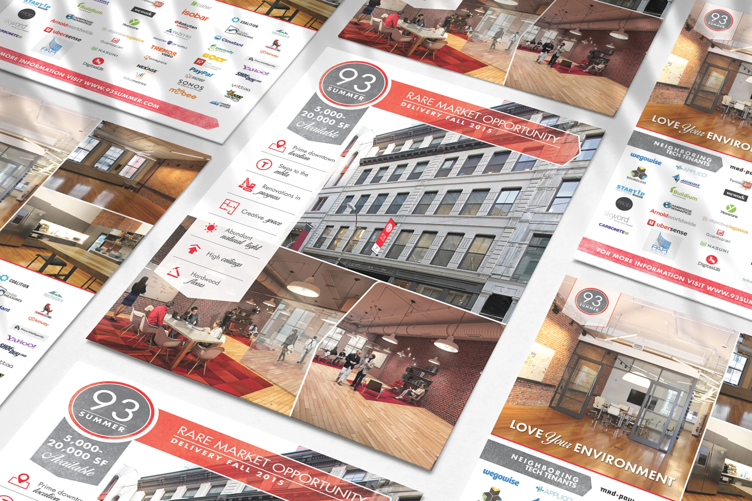
Branding
93 Summer Street
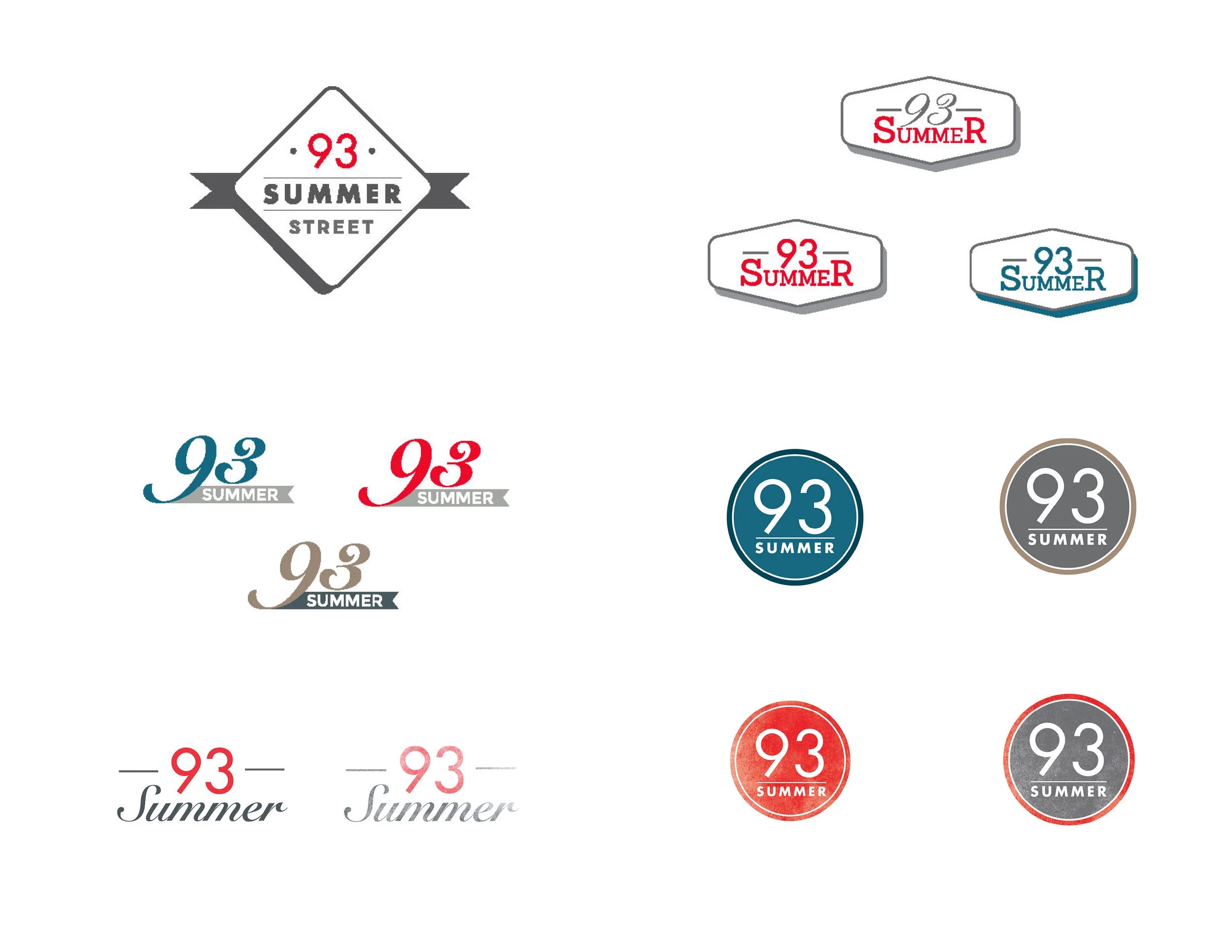
Logo exploration done before and after an office space was built out.
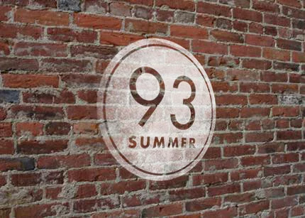
The purpose and message of the brand changed from a clean, vibrant, technology focus to a textured, gritty aesthetic with a more traditional color palette. Thus creating juxtaposition from corporate office and downtown urban life with a wider target audience.
Logo Studies
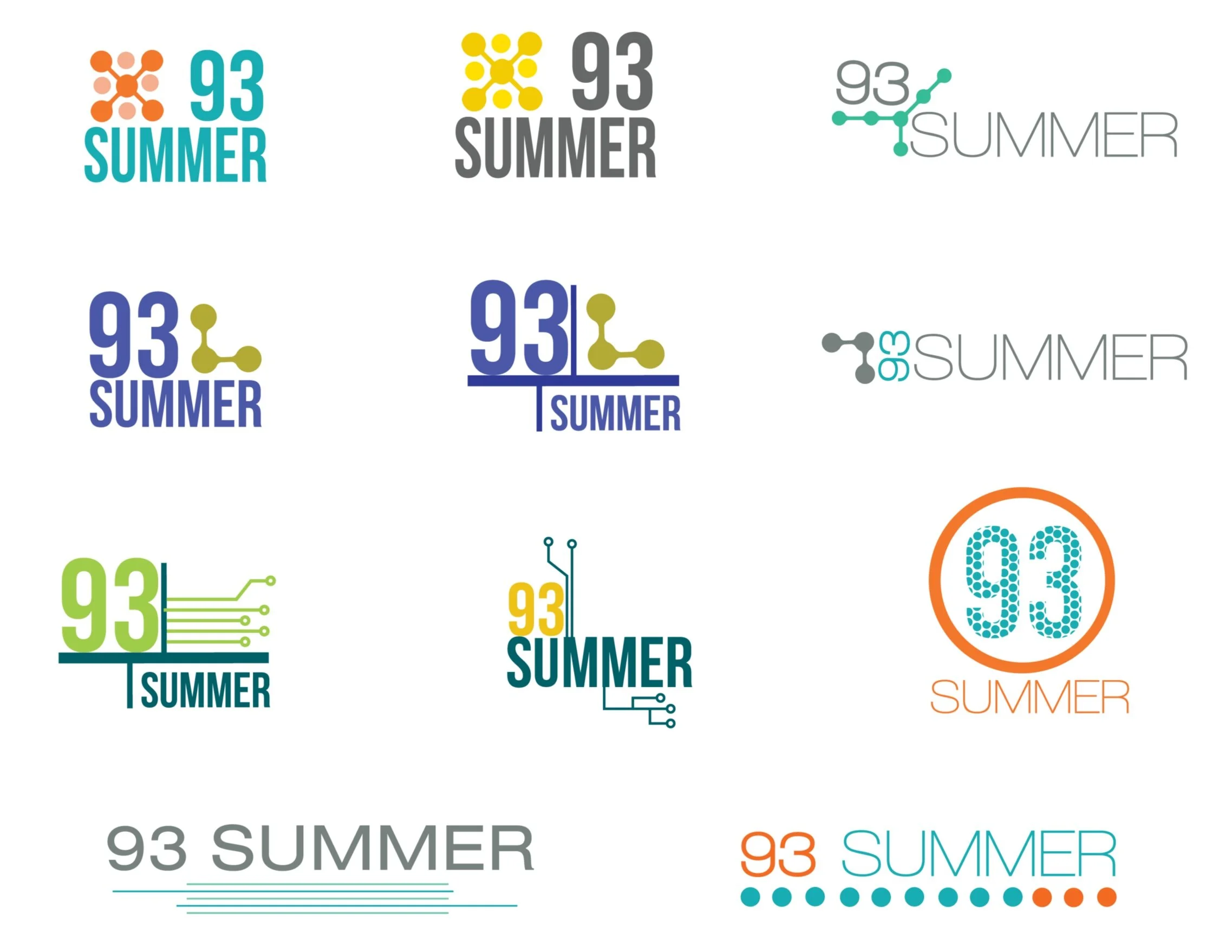
The client wanted to target a young tech based group of tenants to fill their space, which at the time was under construction. Based on this initial targeted audience I created logos with acidic and vibrant colors and used “techie” graphics to compliment the typography.
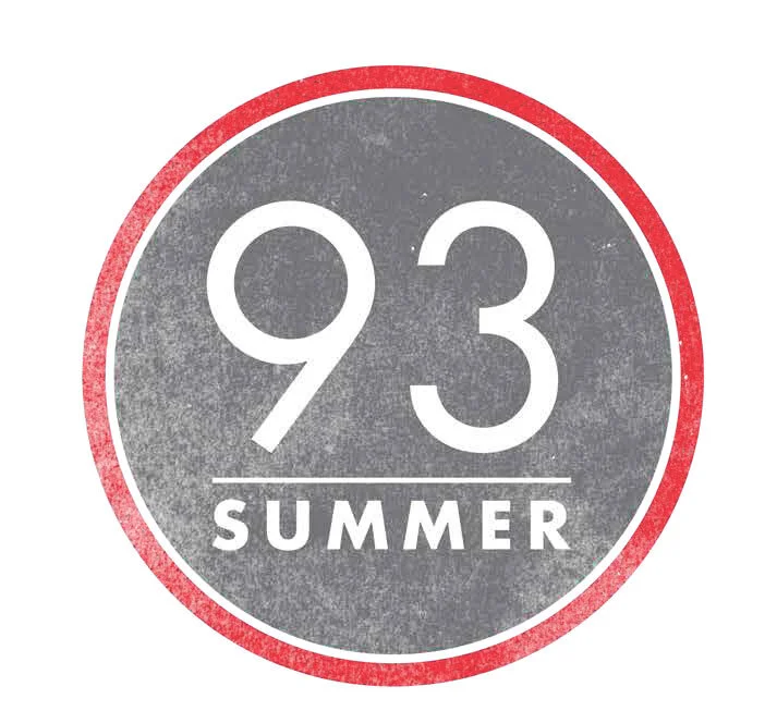
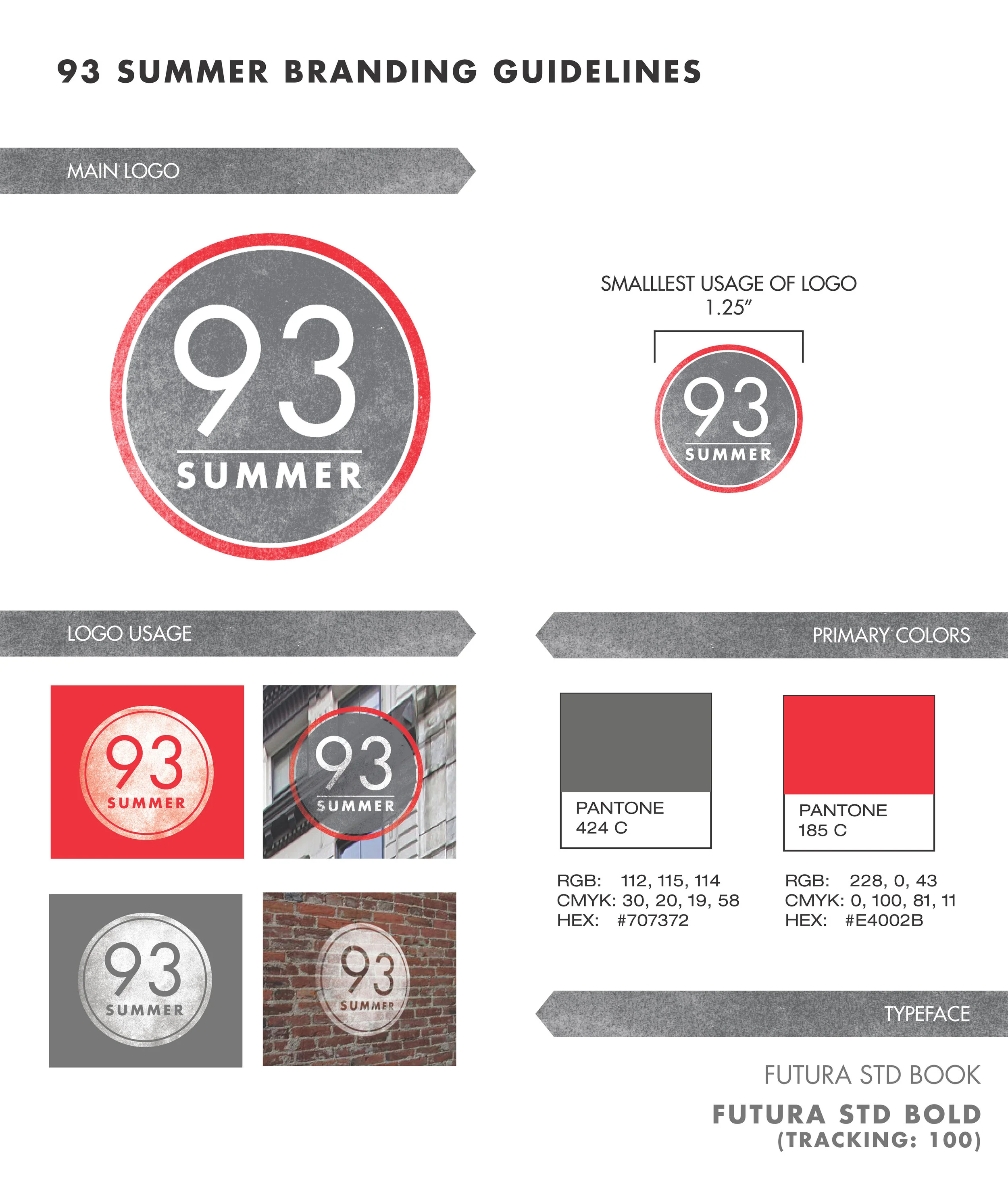
After the first few iterations the client chose the logo below. The colors suggested “summer” and the building marketing campaign would launch after a long winter. The dots also evoke train stops from nearby transportation.

The project evolved as the interior space was built out and materials were chosen. Brick, wood, metals and exposed ceilings called for a grittier feel. We went back to the drawing board and the logo below was the final outcome. The client also chose to go with red to attract a wider net of established companies to join the tenant roster.